Currently, I can see Mars, Jupiter, Saturn, and Venus in the night sky. Sometimes, for the briefest moments, my proprioception extends outward to the ecliptic, bringing a faint passing of vertigo.
Search
John Norris
Donate
Categories
Currently, I can see Mars, Jupiter, Saturn, and Venus in the night sky. Sometimes, for the briefest moments, my proprioception extends outward to the ecliptic, bringing a faint passing of vertigo.
What makes something special?
A few years ago on my blog I dove into what makes an object special. There are lots of things, but two I identified were framing and meaning.
For me, “framing” is how we use physical structures to signify a particular object as special. That may literally be a frame, or a pedestal, an alter, even just a gallery wall. These are things that allow the object to be seen as standing apart from the ordinary.
By “meaning” I am thinking of the non-physical sense we give an object. It is heavily reliant, but not completely, on language. And probably the less I say about that the better, as it is a huge topic in philosophy wherein some very sharp folks participate. Examples are almost any kind of label including a written description, title of an art piece, or an artist statement.
I’ve played with framing and meaning in a number of conceptual and physical art objects, but one idea I came back to was basically a pedestal that also held a label. One could place an object on the pedestal (taking it out of the ordinary world) and add related text to it (‘giving’ it a meaning) – signifying it a special.
Recently, I figured out that the electric test kiln my wife made, and had been gathering dust, worked! (Additionally, we are on a renewable energy plan with our provider.) I went about putting some of my ideas into an ceramic piece.
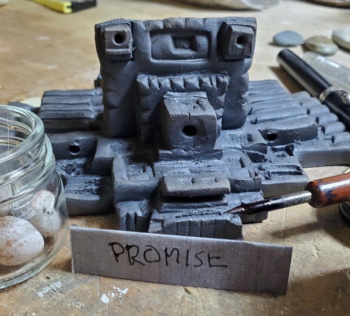
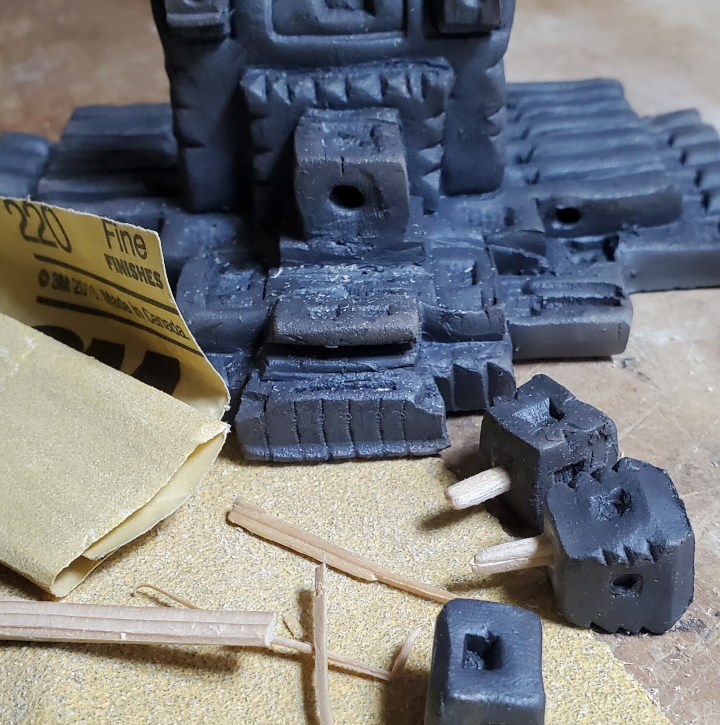
I wanted my piece to not compete with the object it holds. Keeping things simple, I hand made the piece and do a sort of “primitive” firing – I bring the clay up to temperature, take it out of the kiln and smother in it combustible (wood chips) to get a nice dark surface. I think this highlights the decoration as well as the marks from it being hand made.
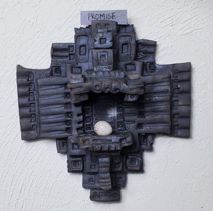
In the end I came up with a wall reliquary that incorporates some of my ideas of a vessel of meaning.

Overall, the piece places the object in the center of the meeting of the horizontal and vertical. The axis both point to the object and extend it’s significance beyond the piece.
I’ve increase the complexity of the piece towards the center, helping draw the eye and increase the excitement/energy toward the object on display. The piece does this with layers as well as stamps within stamps. The roof overhangs the base so as to protect the object.
To accomplish the text component, I include a slot(s) to hold a paper label.

Above the roof is a small vessel with stopper. That allows for another object, small and hidden, to be involved. For those who know, it would interact with the meaning of the visible special object. For example, the visible object could be shell from a favorite beach, and the vessel holding some ash from a particular campfire that was had there. The shelf could show a bead from a necklace and the hidden vessel contain a cloth infused with perfume. One might also contrast a visible piece of candy with a small piece of dog poo tucked away in the vessel.

Other features include a hole below the shelf/base to hold items below the reliquary. Giving another option for a label or imagery, perhaps a decoration such as a tassel.
There is also a hole in the base to hold an optional armature to better display some objects.
This wall reliquary is meant to hold other people’s special objects. Others are to furnish an object, label and perhaps something hidden. And those things can change over the course of time. That makes it a bit of a challenge when displaying it in a gallery. How do I show the reliquary has a special meaning? Do I include an example object and label that people may think is permanent? A short description may help alongside the piece may provide meaning.
One of these will be at the Corvallis Art Center‘s fundraiser “8×8 Art Show – Square Art for Sale”.
Update: My piece sold at the fundraiser. I imagine it displaying and helping give meaning to someone’s special item.


Stopping to smell the roses during one of my evening runs, or in this case, the dust kicked up from a tractor working the fields. Still, it is good to appreciate the moment.
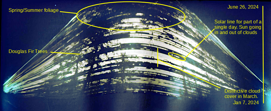
About 6 months ago I put up a pinhole camera outside that was constantly gathering light. After the solstice, I took it down, processed the image, and here it is –

What you are seeing are streaks of the sun as it goes across the sky. As the season progresses from Winter to Summer, the sun goes higher in the image. Silhouetted are trees in our yard and other foliage. The streaks themselves are also broken up by cloud cover. I was able to corrolate the streaks with a weather service’s cloud cover chart.

This was a fun, low-maintenance, project. I am dissapointed the upper image got cut off, but I am not sure there was room. Perhaps it is due to our latitude where the sun has a wide range in the seasons. I was surprised that I think I can see the individual streaks that I assume are days. It was cool to see it match up to the historical weather record.
Nothing special, but this was about the max occlusion from our house. We were lucky to see something through the clouds.
Through a telescope with a solar filter, we could see several sunspots. The smaller one on the upper right (region 3633 at 120MH) is about the size of the Earth (170 MH), the speck towards the center is quite a bit larger (region 3628 260 MH).
The video was with the telescope and into my cell phone, not really fancy astrophotography, but still kinda cool to me. I liked seeing the clouds go by, so I thought I’d share.
