
I had some data where each item had three attributes. I wondered if some could be related or colletated. I thought plotting the three attributes in three dimensions may show something interesting. My current tools couldn’t do it, I was curious about Python, so I decided to give Python a try. The following are my notes in case I need to travel that road again, or to help someone else.
Step 1. Install Jupyter. I’d tried Python before, but was intrigued by the ability of Jupyter to combine other things besides code in the final product – an electronic notebook. In this case, I really wanted to document what I’d done, so I may do it later. I read that the Anaconda version has an easier user interface, So I went that way, reading up on how to install Anaconda (pretty straight forward) then downloaded and installed Anaconda (Windows). I also allowed it to update.
Step 2. I reviewed Getting Started with Anaconda Navigator.
Step 3. I did a quick check in Jupyter with the code “2+2” and ran it. I got “4”, so that seemed good. I ran that code later, and it did not work, so I restarted the kernal and all was well.
Step 4. Python does many things, but needs help to do a 3d scatter graph. I found several different plotting “libraries”, but Plotly was supposed to be good for 3D. I used some more help to install Plotly on Anaconda.
Step 5. I was still a bit mystified about installing Plotly in Anaconda, but figured out to create my first “enviroment” in Anconda, and then I added Plotly to the environment.
Step 5. The next day I had to find where I left off. Doing a search for Jupyter opened a somewhat mysterious window with things happening but also a web page with my file listed. I clicked on the file’s hyperlink and was back in business.
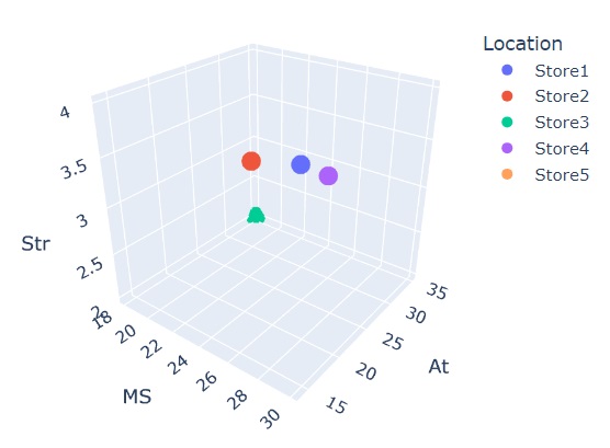
Step 6. I needed some test data and used Notetab to create a simple table and saved it as a CSV,
Location,MS,At,Str
Store1,30%,14,4
Store2,20%,30,3
Store3,18%.35,2
Store4,25%,32,3
Store5,10%,31,
Step 7. Importing the table data into Python. I used the instructions using Pandas. Panda is library that helps Python work with data sets.
Here’s the rest of what I did in the Jupyter notebook,
First we install Pandas and call it “pd”.
import pandas as pdThen we create code that will find the csv file on my PC desktop. It will then import the csv and call it “spreadsheet”,
"spreadsheet = pd.read_csv('/Users/<redacted>/Desktop/john/JohnArtandProjects/3D_Python_Jupyter/5StoreExample.csv')I wanted to check the import went okay by displaying the table with header,
spreadsheet.head()This give us a nice little table with the headers, row numbers, and data. It looked like the csv, so we are okay.
I then import the Plotly Express library, which is supposed to allow for higher level commands that make 3D scatter graphs easier to set up,
import plotly.express as pxPlotly Express uses a data frame to hold the data, so I set the spreadsheet to “df”,
df=spreadsheetI configured the figure “fig” to use “px” (Plotly Express’s) 3d scatter graph service and chose which colum would be represented by which axis, or color,
fig = px.scatter_3d(df, x='MS', y='At', z='Str',
              color='Location')
Finally, I asked for the figure “fig” to be drawn,
fig.show()And I have a nice little 3D scatter graph,
Next stop may be to play around with a bit of formatting titles and such, then find a way to include the code on my site so the graph is interactive.
It turns out the data I orginally was going to use was incomplete, so I will not be using it. However, I figure the above would have helped me out, so I’m putting it out there for others. If folks have more ideas, including suggestions about doing a better job, feel free to reach out in the comments.