Monthly excess mortality across Oregon counties, a cartogram.

Science Advances recently published a paper, “Monthly excess mortality across counties in the United States during the COVID-19 pandemic“, Eugenio Paglino et al, that looked at the number of deaths that were more than expected before and during COVID. From the paper,

Between the first and second years of the pandemic, relative excess mortality decreased in large metros and increased in nonmetro areas. The increases in excess mortality in nonmetro areas occurred most markedly during the Delta wave of the pandemic. 

Monthly excess mortality across counties in the United States during the COVID-19 pandemic

The paper included county level data and charts. I was interested in applying my Oregon cartogram experiment to see any patterns. (The paper was published by Science Advance with copyleft permissions.)

Below is a too-small screen shot, as it is really meant to be views as a web page of the cartogram.

Small picture of the linked to web page,  cartogram with multiple small graphs near the counties of Oregon

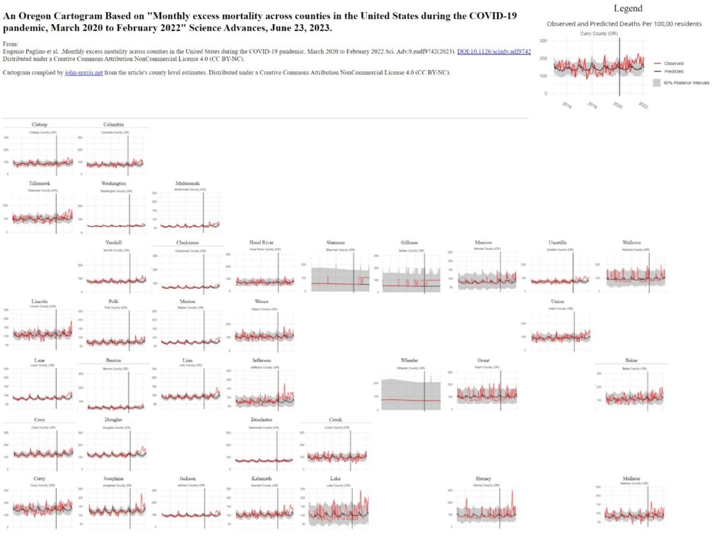
Caveat: This data viz is not a thing of beauty, nor the html/CSS to be proud of, but it was the quickest way I knew how to look at the data in this way. Be careful of the y-axis changes, but to me the interest really lies in how the excess deaths ebbed and flowed over time and not so much the amount.

Posted in DatViz, Medical Informatics, Uncategorized | Tagged , , | Leave a comment

The Aphorist of NE Lloyd Blvd, Portland.

Graffiti "What would ChatGPTDo?" on service box cover attached to street post.
Posted in Art, Microblog | Leave a comment

I enjoyed the variety of thought in the Daily Nous group post under this title. I found Luke Stark’s “ChatGPT is Mickey Mouse” a particularly helpful way to understand LLM’s. Animated characters certainly act intelligent, and may affects us as if they were, but we know they are not.

Posted on by John | Leave a comment

Railroad Moniker Introductory Field Guide

Railroad Moniker Field Guide

Graffiti on trains is illegal, dangerous, and a U.S. folk tradition that goes back over 100 years.

I enjoy looking at railroad monikers (typically line drawings on freight cars). Just for fun, I offer this pocket field guide to a few popular railroad monikers. Click on the image to get the full size version. It is made to print on 8.5 x 11 inch paper.

Click for full image.

You should be able to simply print the full image, but if not, here’s a PDF.

A few thoughts:

  • There’s a lot of different monikers. I tried to choose mostly common ones I currently see, given the space I had available.
  • Why not just have photographs? I learned with birding field guides that a drawing based on multiple examples can highlight commonalities and attributes to help in identification.
  • How to organize a field guide? Originally I thought by subject – such as birds, people, trains. Alternatively, I could go by the moniker’s names. However, I was interested to see how organizing by design complexity would work out.
  • I enjoy the book arts and paper-craft, so doing a cut-and-fold booklet was an inspiration.
  • I also enjoy breaking the 4th wall of the internet, by providing a downloadable object.
  • Released under a Creative Commons attribution 4.0 International license.
Posted in Art | 2 Comments

Art Resources to Share

Clay Class Notes

Some of the most popular content on my blog are two series of ceramic class instruction notes. Time to them to the Fediverse via my account: @John_Norris

Hand building
Throwing
Clay whistles

Posted in Art | Tagged , , , | Leave a comment