(Update Nov 28: Added disclaimer about population health veracity. This graph really is based on the OHA documents, but it has not been vetted by health experts.)
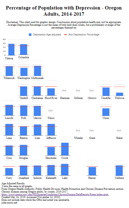
My second run with the Oregon cartogram I’ve been developing with some actual data.
I chose depression because the OHA had more counties represented in it’s chronic diseases report. Unlike my earlier Oregon cardio diseases cartogram, I was curious to see just one disease category.
Preliminary thoughts,
I like the bold, single category bar graph. It fills each block nicely. I can see how the small multiple needs to span enough space so that the overall table retains the shape of the state. I rather roughly tweaked the original bar graph images to get a better look; you can see how that caused Clatsop to be a little wonky – I wanted the numbers not to be too squished. More time could be spent to make this more refined.
It is interesting how one can run along from North to South or East to West to see how there may or may not be any trends. Much easier with the single data category.
I liked the idea of a placing an average line for quick comparison. However, the line is based on the averages of the counties percentages, and not the individual counts within. Thus, it is somewhat problematic. With proper math, I think this brings an important overall dimension to the data. Also, I find myself relying on that line to compare charts and I lose track of the actual percentage. Perhaps all small multiples should have their y-coordinates shown
I may change the “NA” image to fill the same space as the small multiple. I think that will help those areas maintain their location and help the overall shape of the cartogram.


Pingback: Oregon Health Cartogram – Chronic Cardiac Diseases by County | john-norris.net