Oregon Health Cartogram – Depression by County

(Update Nov 28: Added disclaimer about population health veracity. This graph really is based on the OHA documents, but it has not been vetted by health experts.)

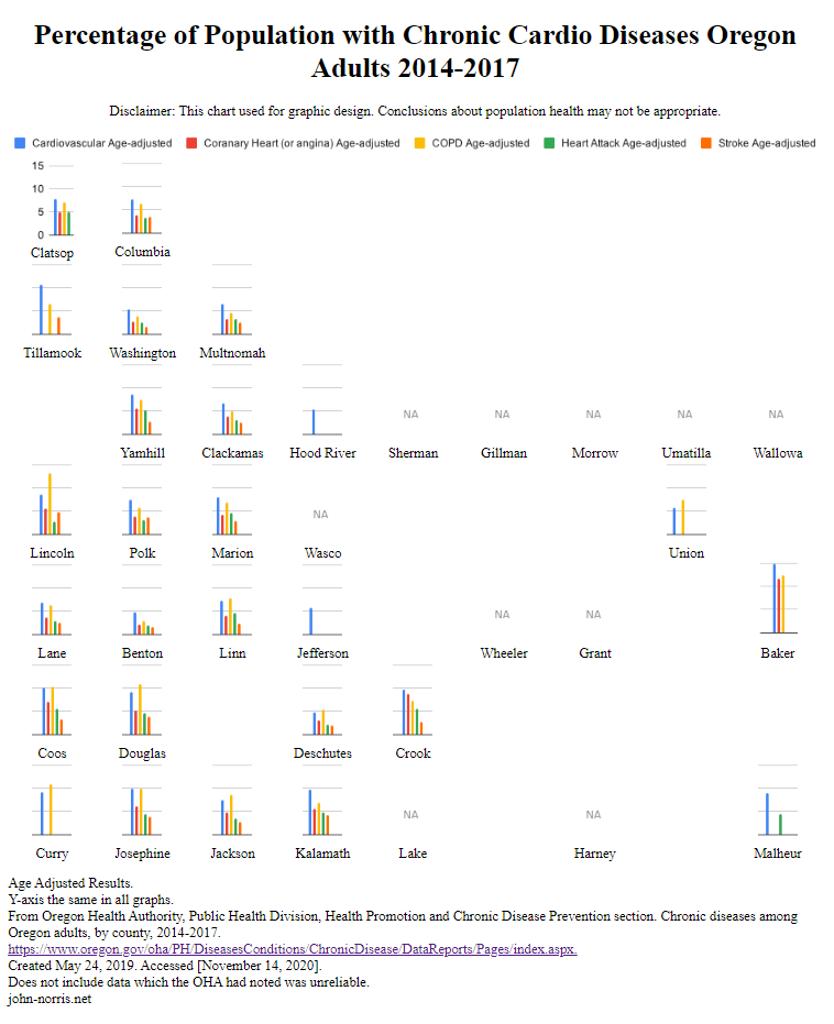
My second run with the Oregon cartogram I’ve been developing with some actual data.

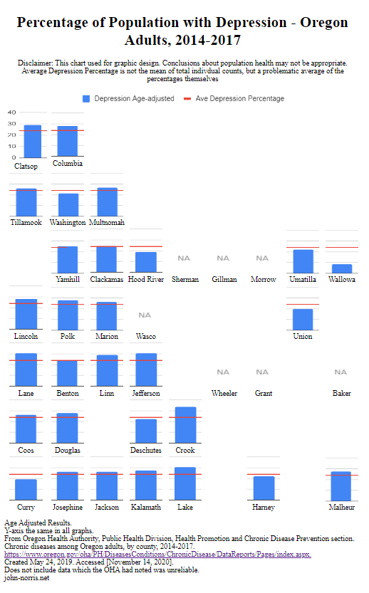
I chose depression because the OHA had more counties represented in it’s chronic diseases report. Unlike my earlier Oregon cardio diseases cartogram, I was curious to see just one disease category.

Preliminary thoughts,

I like the bold, single category bar graph. It fills each block nicely. I can see how the small multiple needs to span enough space so that the overall table retains the shape of the state. I rather roughly tweaked the original bar graph images to get a better look; you can see how that caused Clatsop to be a little wonky – I wanted the numbers not to be too squished. More time could be spent to make this more refined.

It is interesting how one can run along from North to South or East to West to see how there may or may not be any trends. Much easier with the single data category.

I liked the idea of a placing an average line for quick comparison. However, the line is based on the averages of the counties percentages, and not the individual counts within. Thus, it is somewhat problematic. With proper math, I think this brings an important overall dimension to the data. Also, I find myself relying on that line to compare charts and I lose track of the actual percentage. Perhaps all small multiples should have their y-coordinates shown

I may change the “NA” image to fill the same space as the small multiple. I think that will help those areas maintain their location and help the overall shape of the cartogram.

Posted in DatViz, Medical Informatics, Uncategorized | 1 Comment

Oregon Health Cartogram – Chronic Cardiac Diseases by County

This is my first chance to try out the Oregon cartogram I’ve been developing with some actual data.

(Update Nov 28: Added disclaimer about population health veracity. This graph really is based on the OHA documents, but it has not been vetted by health experts.)

(Update Nov 27: I was too focused on the data when I uploaded this and not on the overall cartogram itself. I like the way the data relates to others geographically close to it, which is kind of the point, but nice to see it in action. You can easily compare the coast to in-lands, the Portland metro area to elsewhere, North to South, etc… Those blank areas where their are not counties shown are disconcerting even when you know Oregon. Hard to tighten it up, ‘tho. Also counties with no data, marked “NA” is odd. The OHA has some similar data on depression with more counties, but only one category; that sounds interesting, so a depression cartogram is up next. )

Some things I’ve learned so far,

How does one handle possibly unreliable data? Cite it. Looking at this graph now, I should go back and maybe add and note which counties the OHA said were unreliable. I did not to distract with a footnote, but there may be a clean way to note it. It would fill the graph better.

What to do with no data? Nothing is better than null. I placed a light “NA” graphic to fill the space, but not compete with the data I had.

Graphic image or coded block? Go with your strengths. Despite a few hours of trying, I could not work with WordPress to make an html table graph on the page format properly. I really wanted the possible interactivity options and the abilty to quickly swap out new small graphs for different topics. I ended up taking a screen shot of my code in the browser and called it good. Not ideal, but this allowed me to get something up. As an aside, I wanted to use SVG’s for the bar graphs so I wouldn’t have to deal with images and files. That will take more skill development, and time.

I wonder if radar graphs would have been a better choice to compare small multiples. One worry I had is that some categories did not have any data, and I thought the radar chart may not show that easily. (I used Google Sheets pivot charts to make a large bar graph which I then split up with GIMP. I didn’t see how to easily do a bunch of radar charts.)

More thoughts from me perhaps later. I’m always interested in constructive criticism.

Posted in Medical Informatics, Uncategorized | 1 Comment

Reading Tufte

Finished up the first three volumes from Edward Tufte on data information and visualization. While I read a bit a few years ago, and follow data viz on Twitter and the web, it was good to sit down and go through them. I will pick up “Beautiful Evidence” at some point for sure.

I very much appreciate the history of data viz Tufte goes though, as well as the amazing examples from the pragmatic side of data viz. (There are many examples of amazing not-so-pragmatic data viz out there.)

Posted in Uncategorized | Leave a comment

SQL Fundamentals

Like last week’s effort with Regular Expressions, I’ve been piecing together SQL queries for some time now and decided to work through a lite tutorial. I noticed the website with the Regular Expressions tutorial also offered SQL; so I jumped into SQLBolt.

I am much more familiar with SQL than Reg Ex, but there are areas where my knowledge is thin. Above all, it was a good for me to do exercises in a different domain, where I got to use arithmetic, as well create/update tables.

SQLBolt did a good job of breaking down the basics. SQL is a large topic, and the SQLBolt‘s format was a bit strained to capture all that was needed to understand each lesson. However, it was not overwhelming and the gratification the interactivity provides helps keep one motivated.

SQL BOLT's tutorial completion page.
Posted in For Hire | Leave a comment

Regular Expressions

To clean up data for analysis, I’ve had to dip my toes into regular expressions. For example, writing a line of instructions that can separate first and last names and removing middle ones from a list of people.

To do this, I use the tool Notepad++, a free text editor whose find-and-replace allows for regular expressions.

However, for far too long I’ve relied on searching the web for snippets of instruction that will fill the immediate need. So I this morning I went through the RegexOne series of lessons and practice problems. They do a great job of breaking down the areas, providing instruction, problem sets, and interactivity. I highly recommend this course. (I even gave them a donation.)

I did RegexOne
Posted in For Hire | Leave a comment