
How to convey to a patient the multi-day process of diet restrictions and medication prior to a colonoscopy?
While the instruction list in quasi-outline form (based on the number of days before the procedure) is informative, I thought I could improve with bit of data-viz marginalia. I sketched a proposed timeline to the left side of the text. I think it would improve compliance.
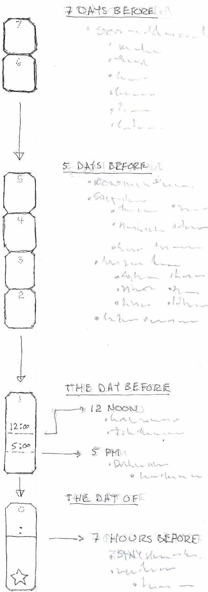
Each block represents a day. Each group of days is related to the text instructions. (Which may be propietary to the particular vendor I had access too. Thus, I did not include here.) Arrows between the groups allow for extra text/pages of text before the next group of blocks.
Each block has a faint number inside, which is the number of days before the procedure. The idea is the patient/caregiver would fill in the actual date/day of week in each block.
The final two days/blocks are subdivided by lines for diet/medication changes during that day. The day before has static times given by the vendor. The final day has a time which is dependent on the time of the procedure, so space and a colon are provided for someone to note that.
I also gave the blocks a dark to light outline as the process progresses, helping to convey the passage of time to a goal, as well as the literal outcome. I hope the blocks and tones are not too scatological, but it is what it is. 🙂