Looks like I’m a little late this year, but I’m once again setting up the chickadee birdhouse with web cam. (Last year’s was mid-March.) This year’s big improvement is a more easily removable roof with wing nuts. The idea being that birdhouses should be up all year, but I really don’t want the camera out that long, so I made the roof easier to swap out.
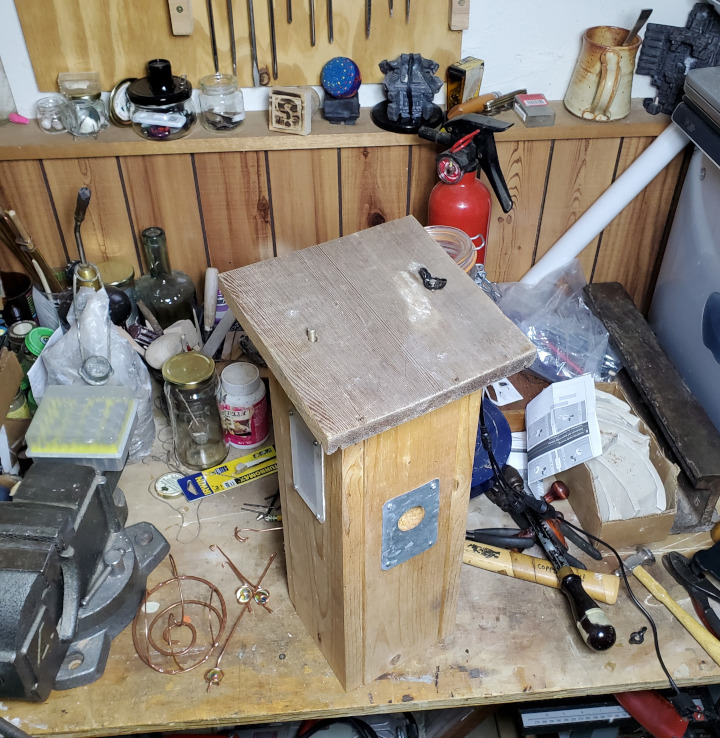
Excuse the mess!
The birdhouse is now outside on its post, and I’ll be stringing power to it shortly. Maybe I’ll look into getting some solar and taking it off grid at some point.
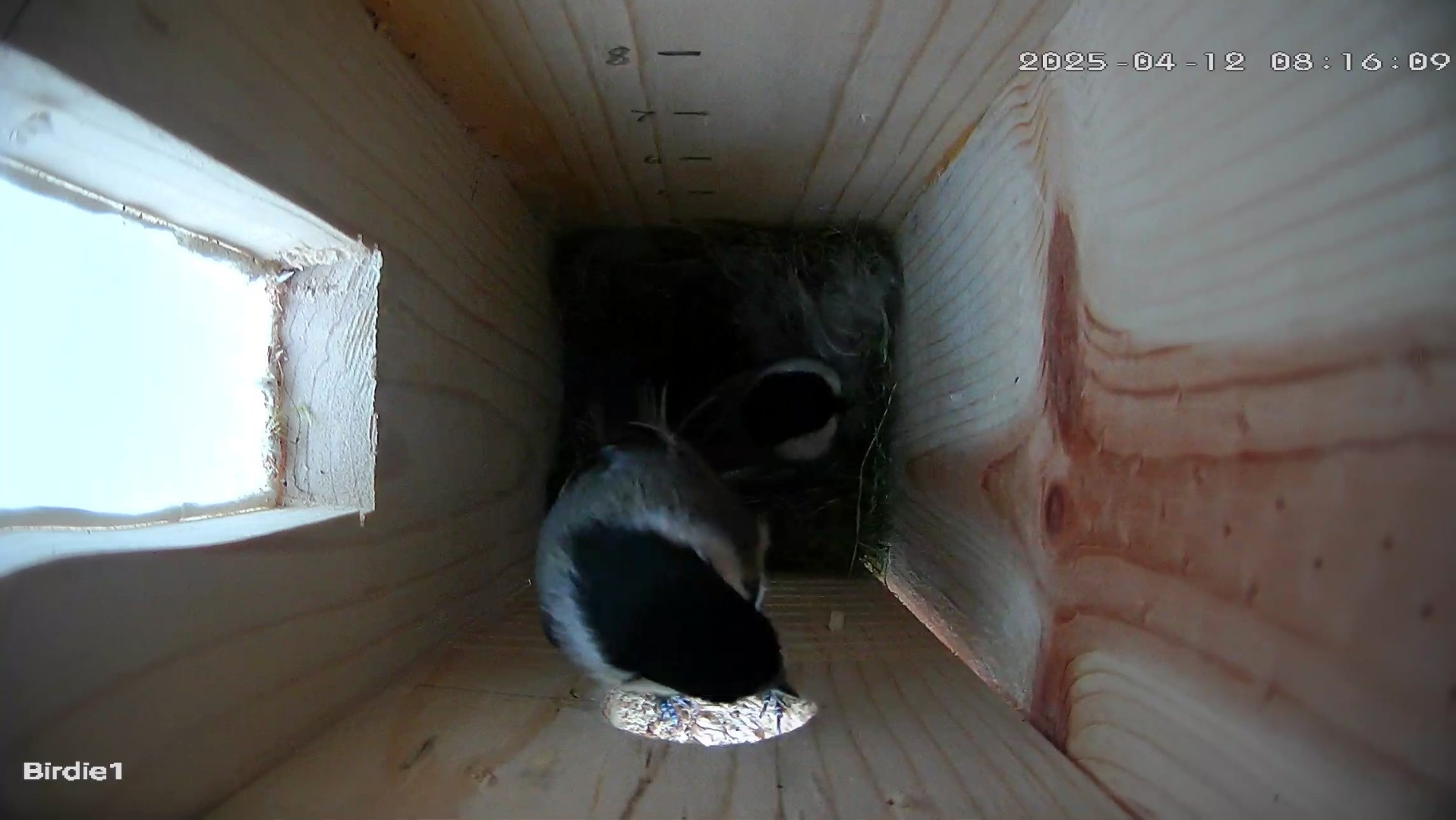
Update 4/17: It took less than a week, and when we checked the camera, there was moss in the bird house, indicating someone decided to move in. However, we were not seeing birds, so I had to do a quick test.
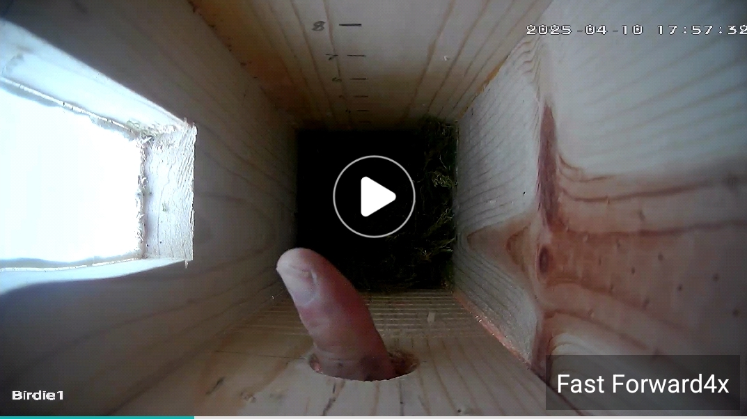
Things looked good, and we eventually spotted birds.
Now we wait for eggs.
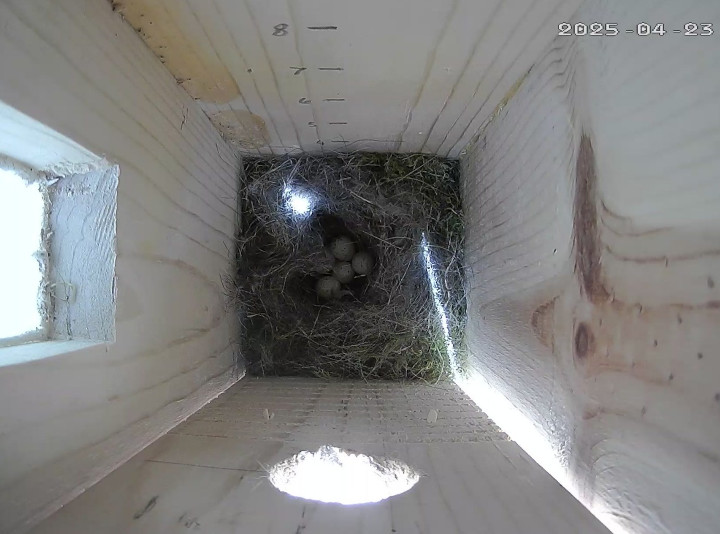
Update 4/23: Five eggs!
We are not sure if they were hiding the eggs under feathers when not in the nest, but this morning we see five eggs!
I’ve not kept great track of when changes occur in the bird house, here’s what I noted on my past blog posts –
| Year | House Up | Moss | Eggs | Hatch | Left |
| 2025 | 3/30 | 4/17 | 4/23 | ||
| 2024 | 3/8 | 3/26 | 4/17 | 5/4 | 5/24 |
| 2023 | 5/2 | 6/3 | 6/21 |